Selected Projects
This showcase features just a few of the digital projects we’ve worked on. You can also find further case studies on each page in the CMS agency and web agency sections.
-
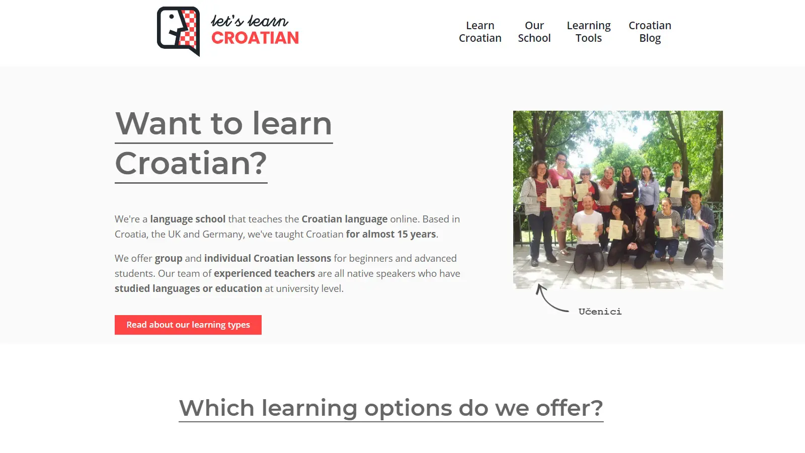
Back-office system for online language school | 2022
We built a robust back-office system for ‘Let’s Learn a Language’, integrating Symfony and Vue.js. This led to a significant reduction in admin workload and contributed to the school’s most successful quarter in 2022.
-
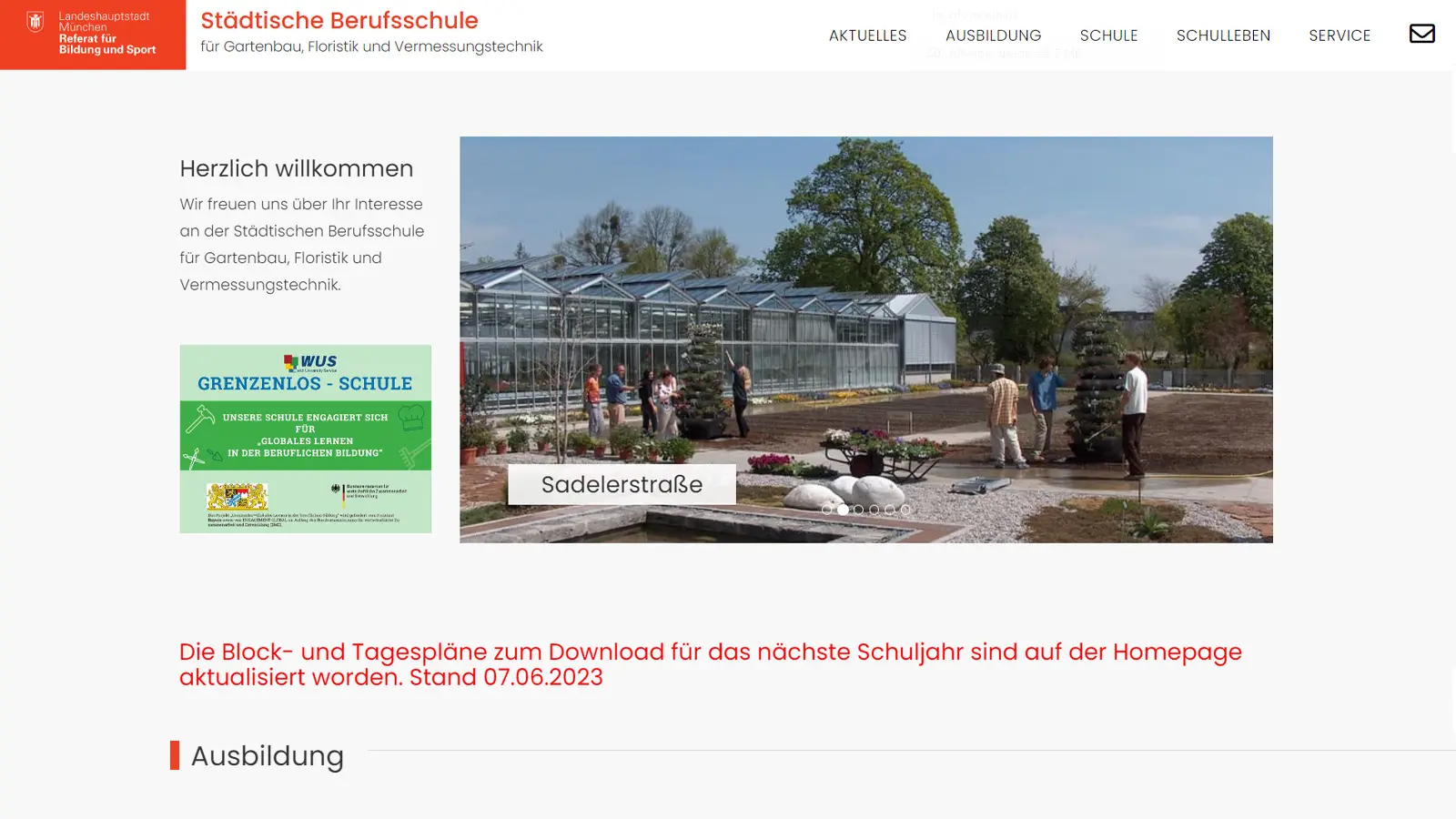
Joomla Websites for Munich Schools | 2018
In 2018, we developed a Joomla website for Alice Bendix Vocational School Centre in Munich. Thanks to the success of this project and the support of the City of Munich we went on to build 10 more school websites, delivered cost-effectively by reusing common elements.
-
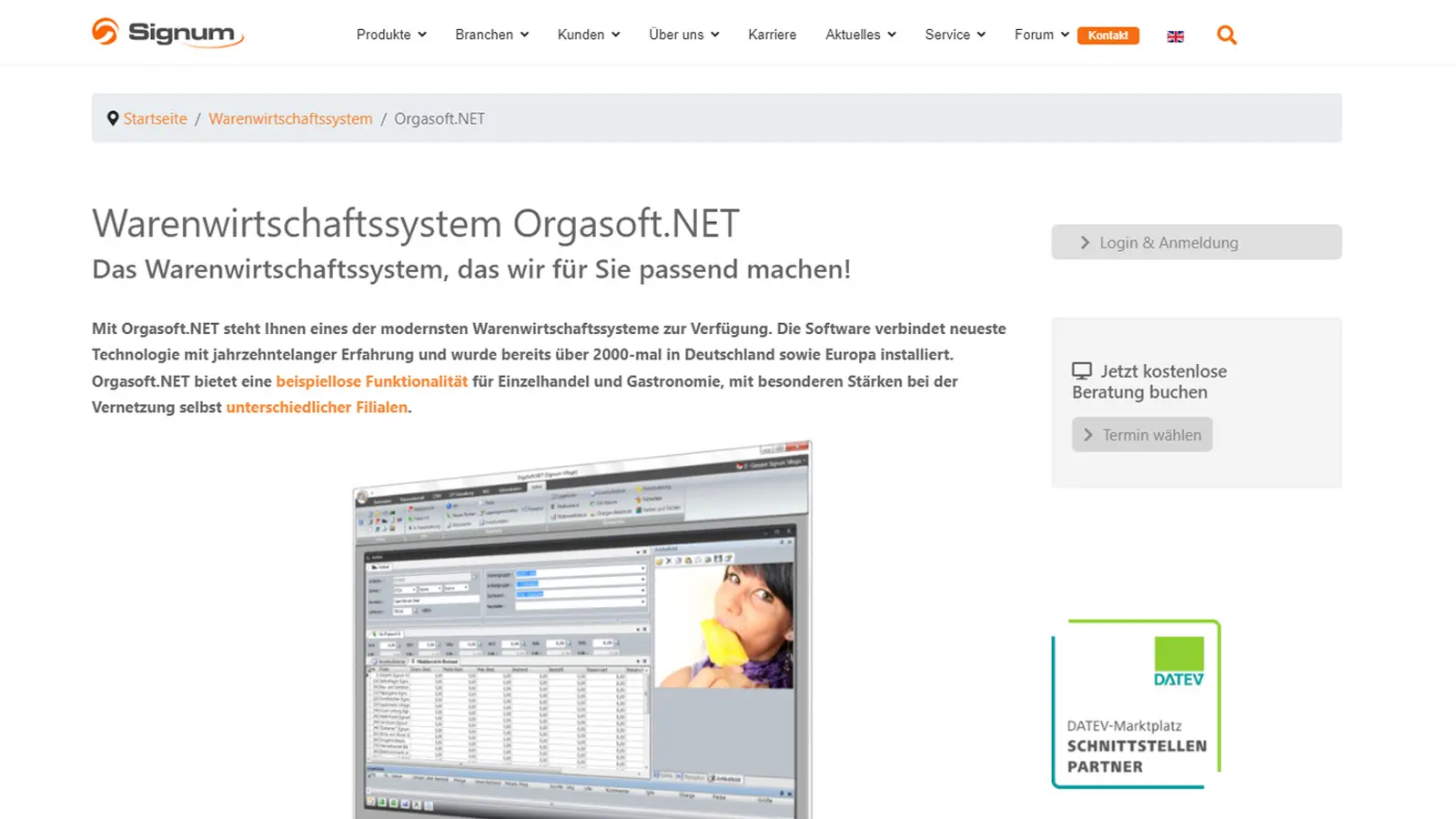
Theme-based WordPress Product Microsite | 2019
In 2019, we developed a WordPress product microsite for Signum to showcase Orgasoft.NET. The site, designed using a carefully selected theme, achieved a sleek look, launching successfully and increasing software sign-ups by 120% within a year of launch.
-
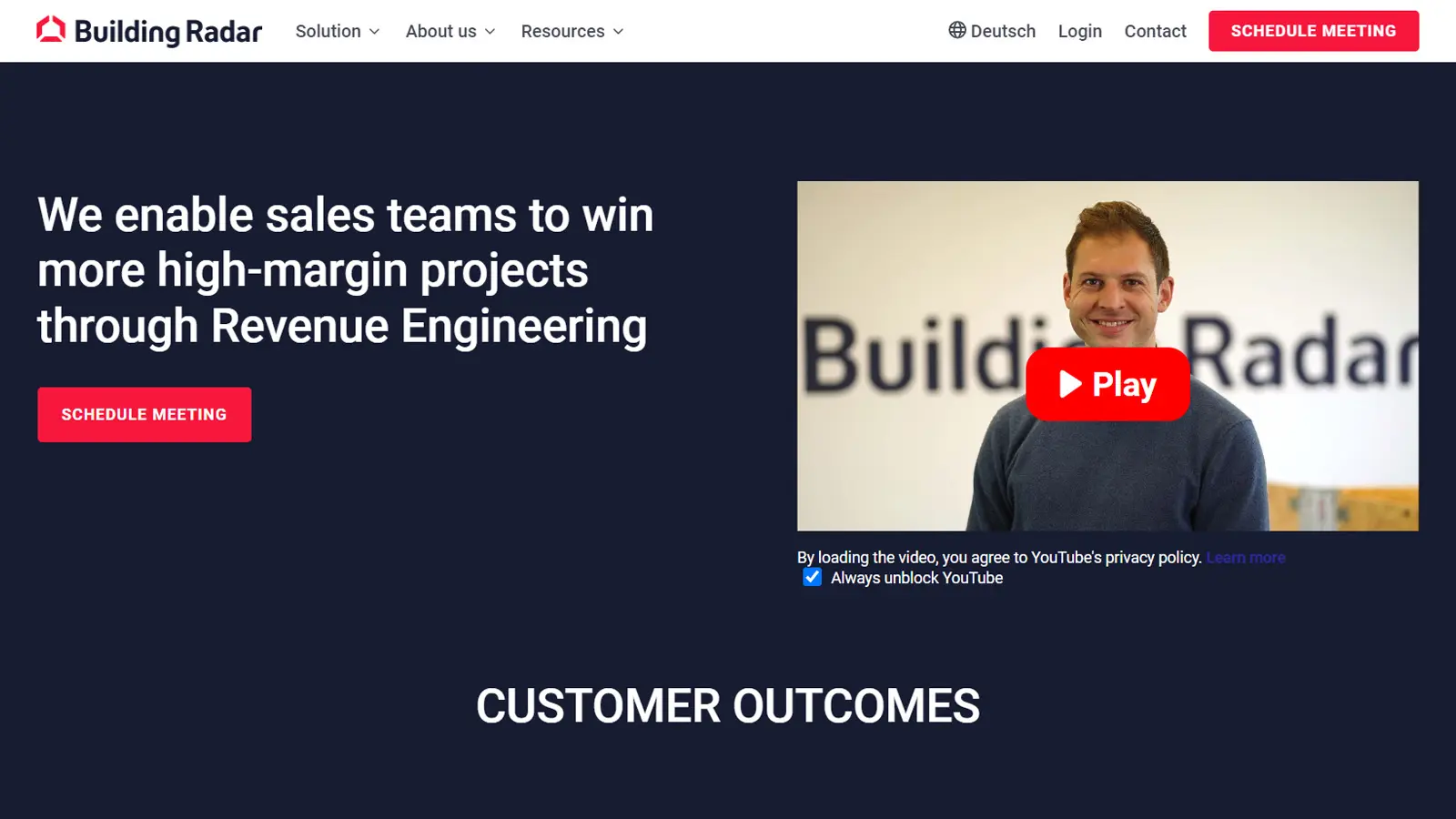
WordPress Enhancements for Building Radar | 2023
In 2023, we revamped Building Radar’s WordPress site, enhancing their references section and overall website effectiveness. Besides redesigning for business focus, we boosted site speed, improving Google PageSpeed Insights score and user engagement metrics.
-
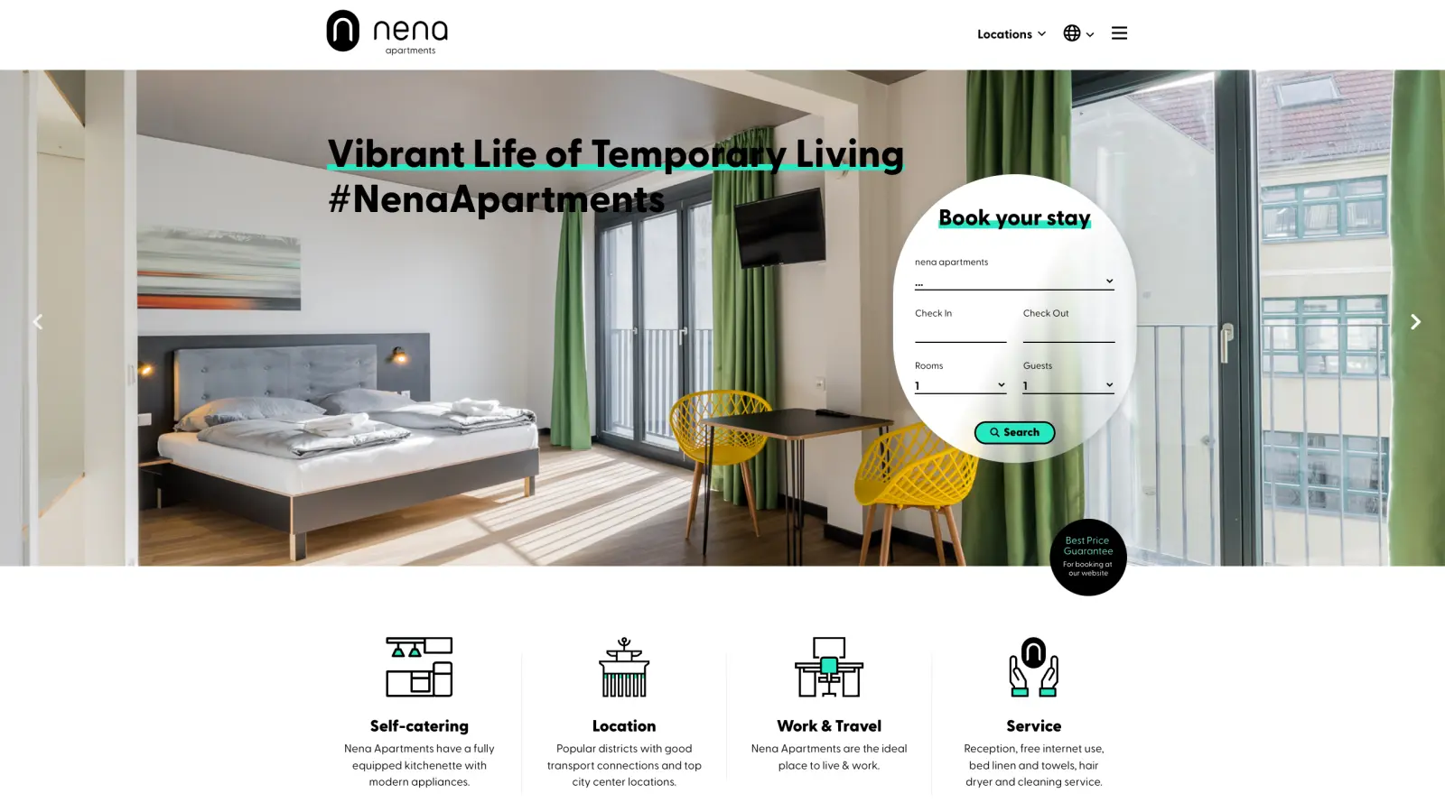
Accommodation Platform WordPress Website | 2022
Cansmith, a marketing agency, approached us in 2022 to develop a website for a new business venture, Nena Apartments – a stylish apartment rental service targeting a younger audience. Their requirement was a visually appealing, multilingual site website that mirrored the modern and unique interior design of the apartments. The design for the project was delivered by Cansmith, while our focus was on implementation. An additional challenge lay in a very tight budget and timeline, since the site was for a startup that was waiting for completion of the website before they could launch their business.
-
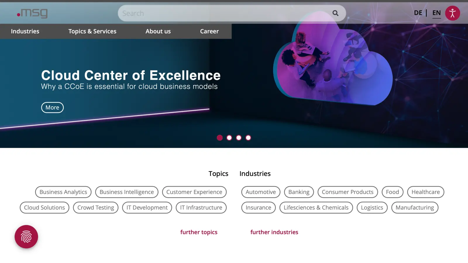
Building an Industry-Level Career Portal for msg systems | 2020
Test
Tasked by msg systems, an IT solutions provider with over 8,500 employees, in 2020 we built a Joomla-based career portal for IT professionals. The portal features 350+ job vacancies and integrates with existing systems for seamless data import/export. The portal’s success was confirmed when msg ranked 3rd in a German study evaluating online career presences.
-
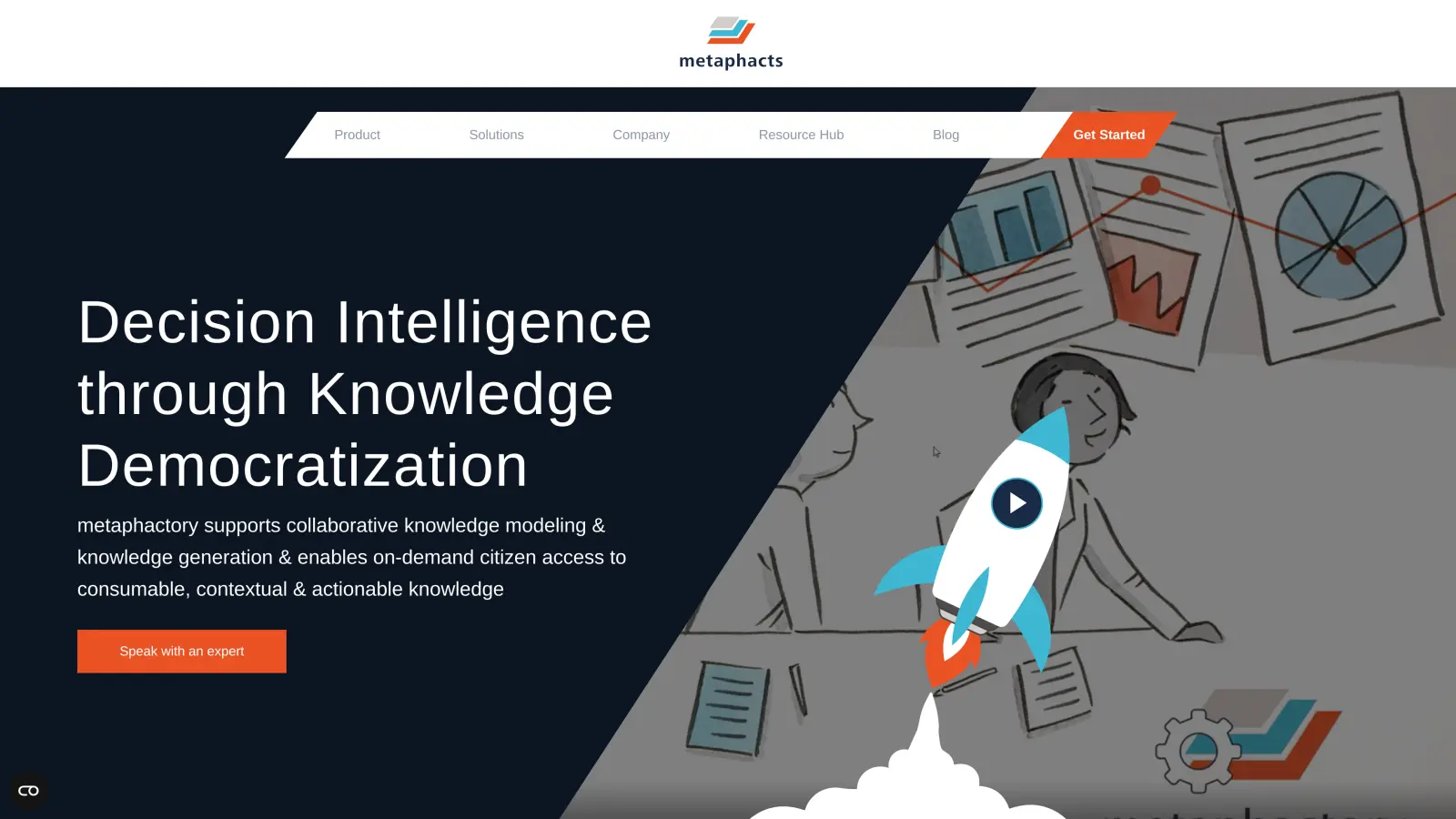
Redesigning and relaunching the Metaphacts website | 2021
The Challenge Metaphacts approached us in 2021 with the task of redesigning and rebuilding their website. Their previous site had been built with Joomla, and it was their wish to stick with Joomla as their CMS. For their business, the website plays a crucial role, both in acquisition, by providing product information and a process for users to register for a trial version of their software, and in building and maintaining a relationship with existing customers, via their “Resource Hub”. As regards the design of the new website, the client had a clear vision: The design should be modern, fresh […]
-
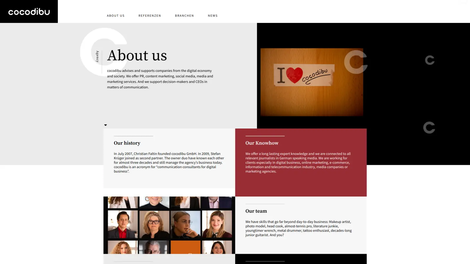
Cocodibu Agency
Website Relaunch
-
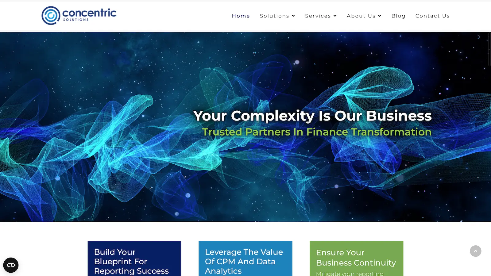
Concentric Solutions
Website Relaunch
-
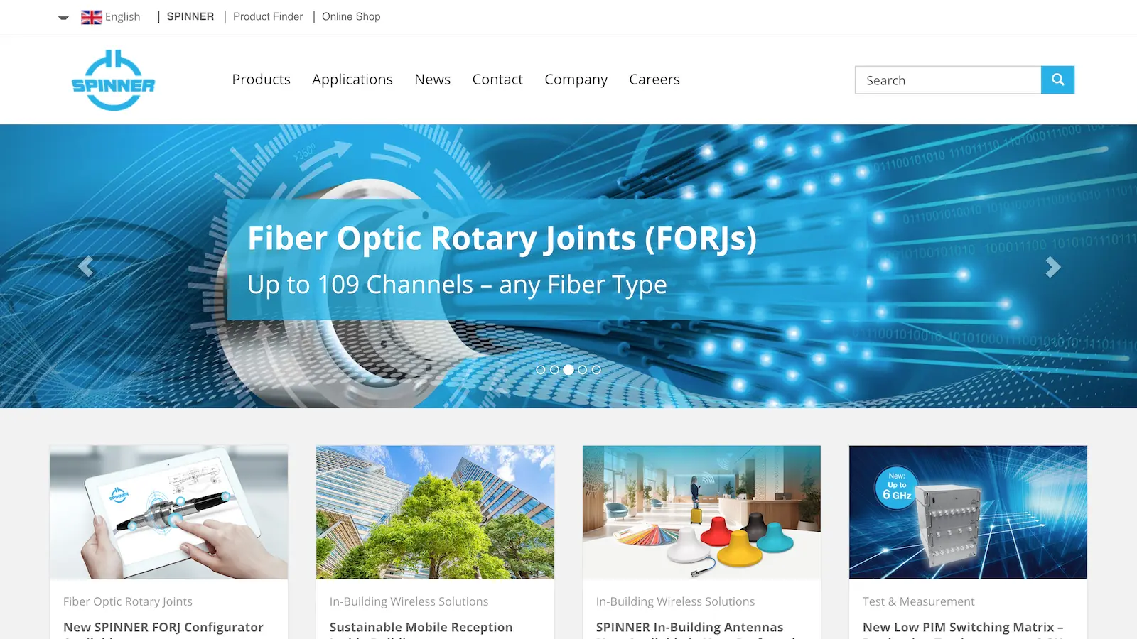
Spinner Group
Website Relaunch
-
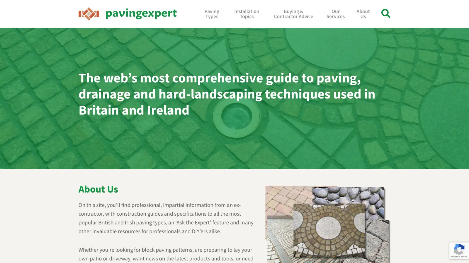
Large-scale Migration to Joomla with Matomo tracking | 2019
HV Digital’s remarkable project involved migrating a 25-year-old paving website to Joomla, preserving SEO rankings, and implementing Matomo analytics. They overcame content challenges with Python and JavaScript, created a custom design, and satisfied a passionate client. The SEO-focused approach led to improved rankings and ad revenue. Tony McCormack, the website owner, praised HV Digital’s competence and professionalism in managing this complex transformation.
-
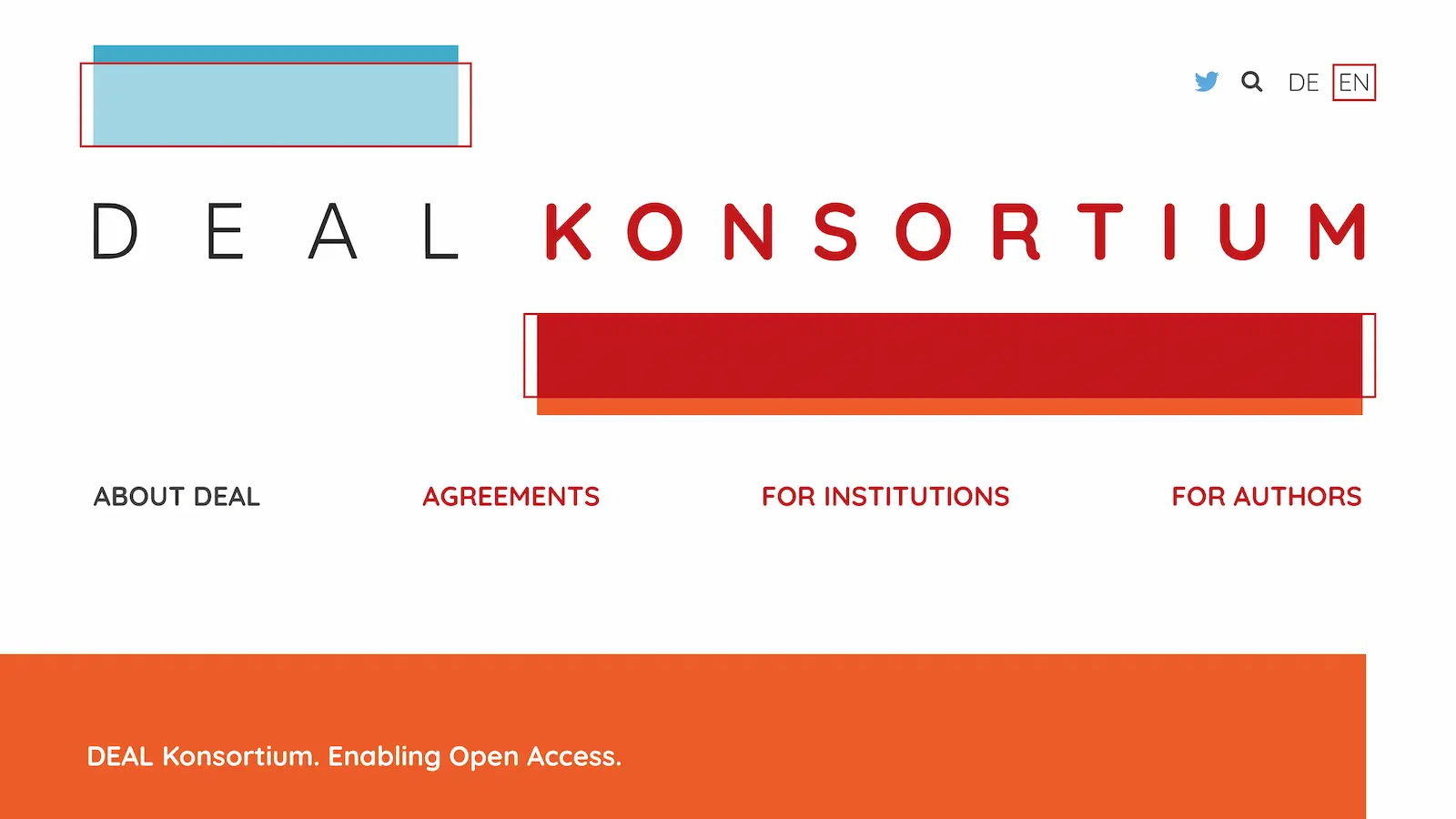
Open Access Publishing Platform for MPDL | 2020
In 2020, Max Planck Digital Library (MPDL) asked us to develop a website for their Open Access agreements with academic publishers. Faced with the challenge of aligning MPDL’s ideas with practical design, our collaborative effort led to a user-friendly, multilingual site. This project not only enhanced access to research literature across German institutions but also demonstrated our capability to effectively translate client vision into digital reality, marking a significant achievement in our portfolio.